Challenge
Scuba divers have a need to track their dive events so that they may keep up with the number of dives they have done, the equipment they have used, the logistics of the dive, the location of the dive and the experience they had. We wanted to create an application that would allow easy entry of this information and prevent loss of information often associated with proprietary dive computer software and paper journals.
Research
I conducted five interviews and discovered most divers are taught to log their dives; it is part of their training. And many of the interviewees kept the habit. Many users log in paper books as they find software difficult to use. They tracked their technical information and sea life. Most respondents found no issue with tracking the technical aspects of their dive but there seemed to be more of an issue when tracking sea life.
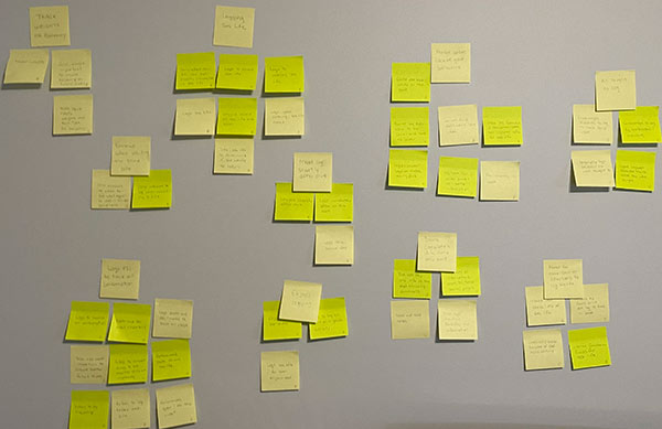
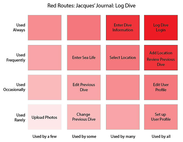
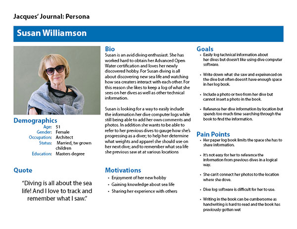
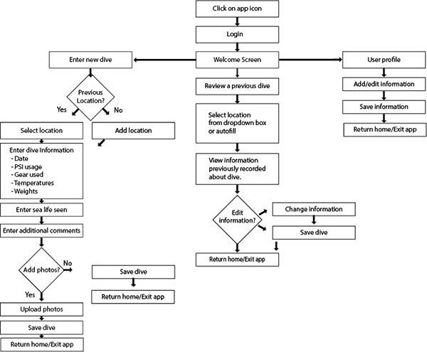
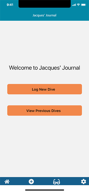
From these interviews I created an affinity diagram to organize the responses. Taking what I learned about the users I designed red routes, a persona and user flow. The research indicates there are three main tasks the user will need to do to maintain a dive log; enter a new dive, review a previous dive, and set their user preferences. Some additional features users would like to see include adding photos and having larger comment areas where they can enter journal their dive experience.
Affinity Map
Red Routes
Persona
User Flow
Design
Using the red routes and a user flow, and after sketching several ideas of possible screens for the application, I completed low-fidelity wireframes of each screen that leads the user through the application. These wireframes were then tested with a group of users. The users found the application easy to use and the information to enter straightforward.
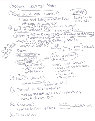
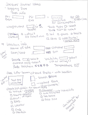
Ideation Sketching
 |
 |
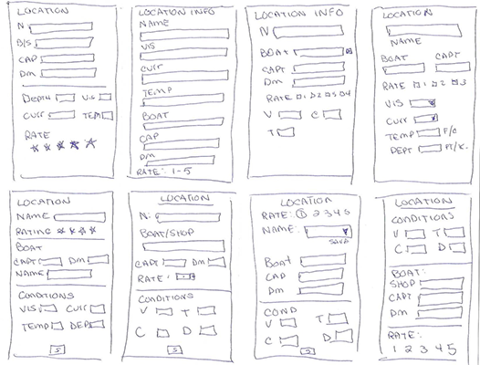
Low Fidelity Wireframes
 |
 |
 |
 |
 |
 |
 |
 |
 |
 |
 |
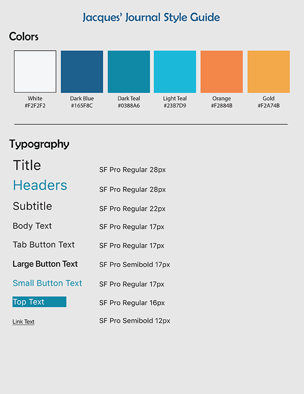
I found some of the navigational elements and labels were confusing. Using user input, I revised the wireframes to create high-fidelity wireframes which included the selected color scheme, iconography, and typography as well as improvements in the navigation suggested by the testing.
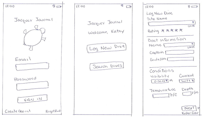
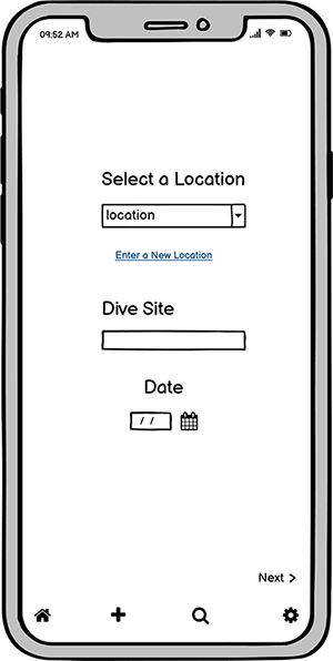
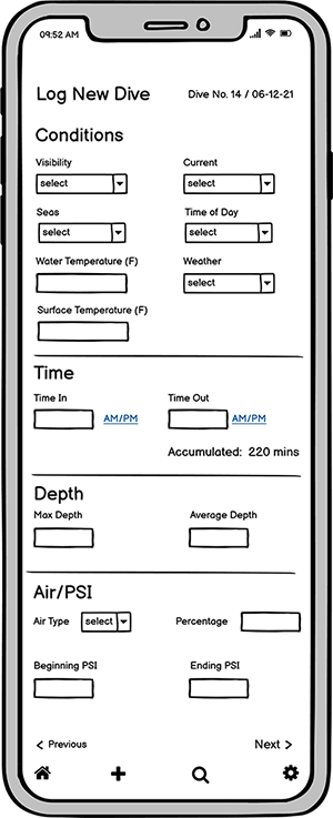
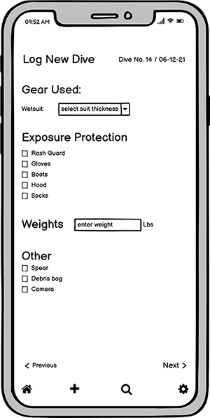
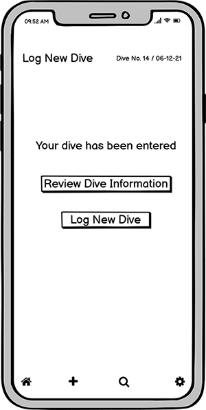
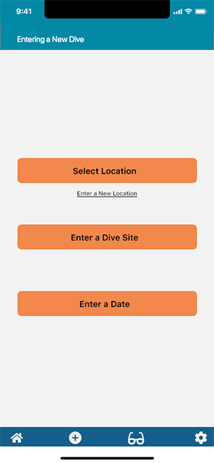
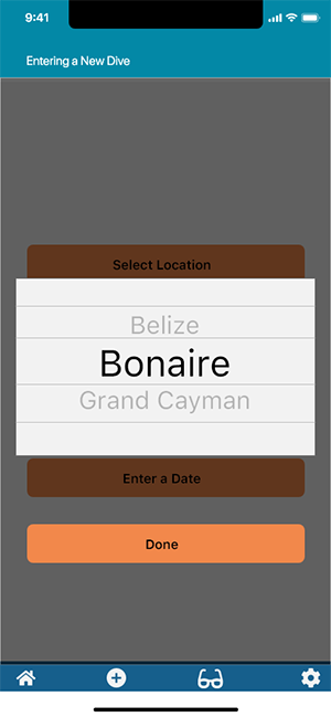
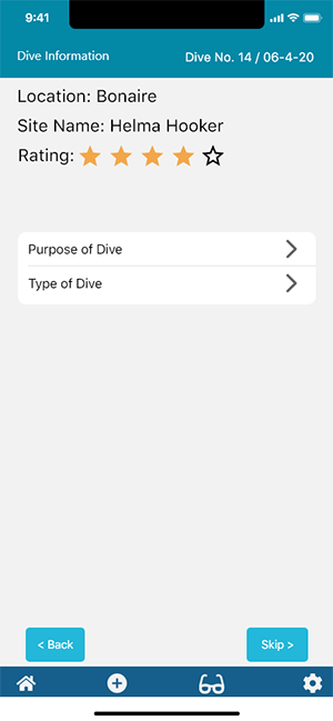
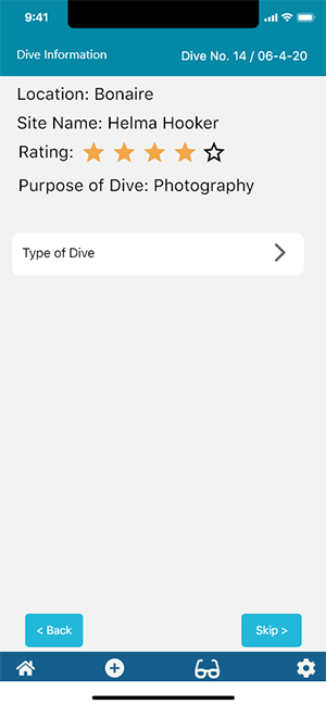
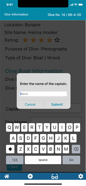
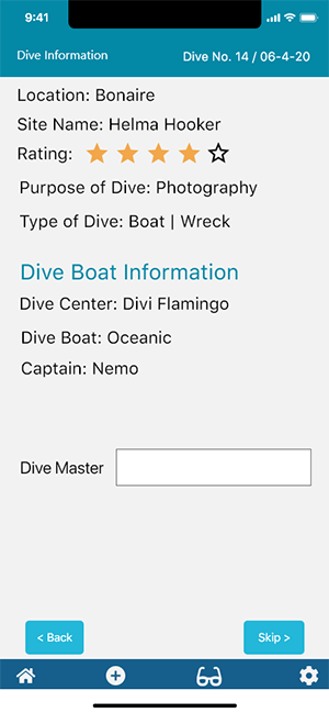
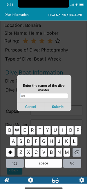
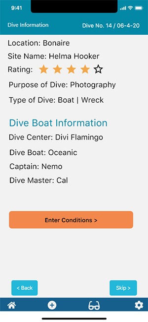
In creating the high-fidelity wireframes, I limited the screens to the first section of entering a dive. The wireframes were tested with five users. The users again found that entering the information was simple and straight-forward. The changes in navigation structure and labeling helped to clarify the interface and the users quickly understood the tasks before them.
Since the bulk of the application requires recording information it’s important for the navigation and input elements to be intuitive. After recreating some of the elements and clarifying the navigation the users found it easier to understand the information they needed to input and how to input it.
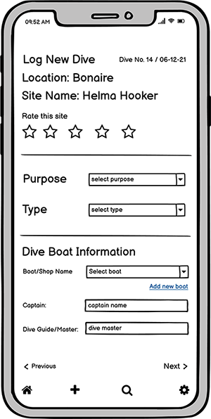
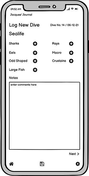
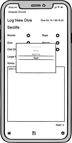
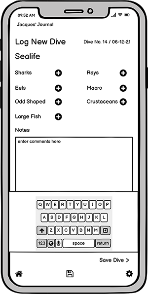
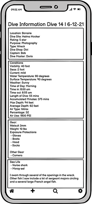
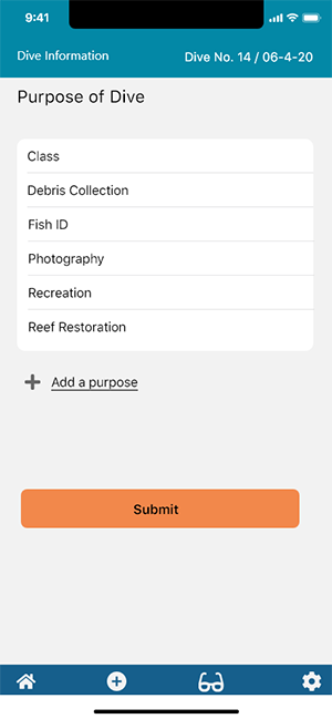
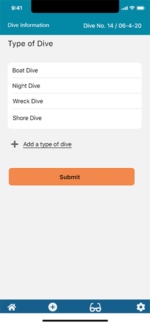
To address the need to enter sea life I incorporated a series of select boxes that allows users to choose items from categories of sea life. This makes it easier to input the large variety of fish that a diver may encounter on a dive. Also incorporated was an area to allow the diver to journal more details about their experience.
Style Guide
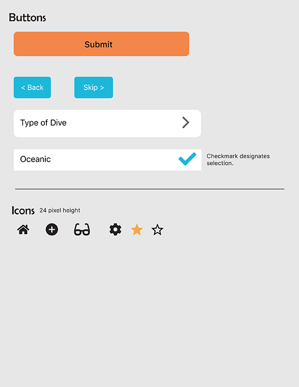
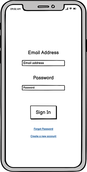
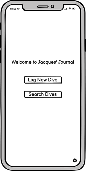
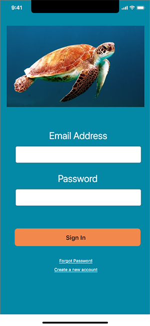
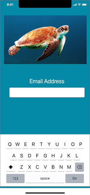
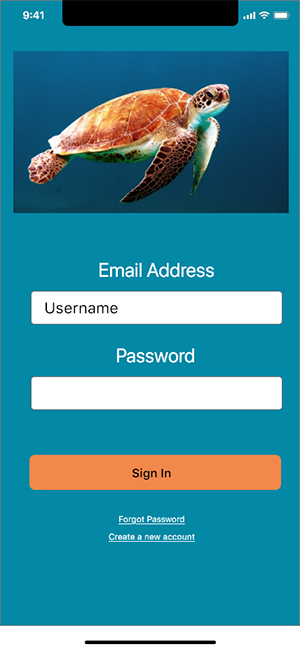
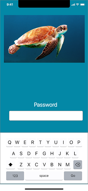
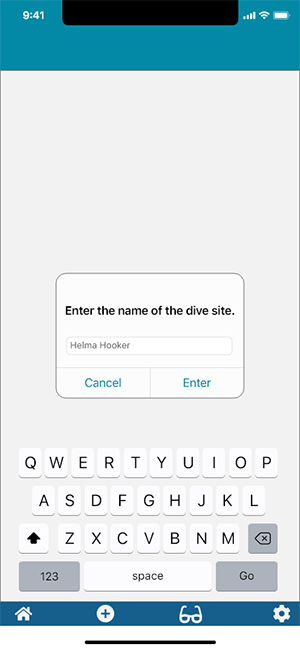
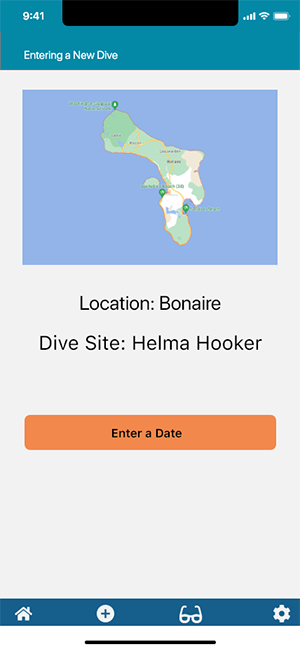
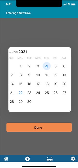
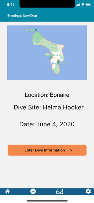
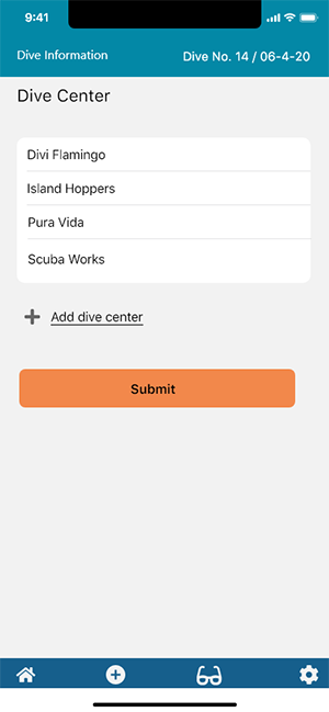
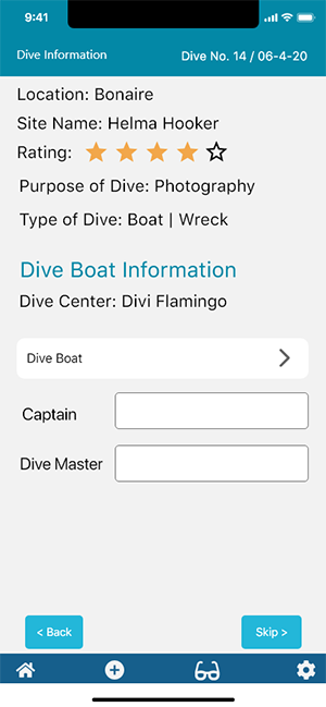
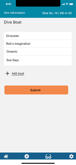
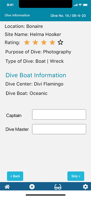
High Fidelity Wireframes
 |
 |
 |
 |
 |
 |
 |
 |
 |
 |
 |
 |
 |
 |
 |
 |
 |
 |
 |
 |
 |
 |
 |
 |
 |
Prototype
Conclusion
From the initial response of the users there would be a demand for this application. It is basic data entry but using the right input elements and clear navigation allows for easy input of the information and it would be a great resource for any diver. From the initial idea extra features could be added such as the ability to add photos, access to a library of sea life, or connection to a dive computer. I feel the resulting product provides a comprehensive, but not overwhelming way to enter all the pertinent information a diver may want to record with the options to add or skip any information they want. Overall, the response to the app design was positive and users would not only use the app but recommend it to others.