Project Overview
Volunteer choirs have a need to track information about their members. This includes contact information, participation information such as attendance and music and ticket distribution.
The proposed app would allow members to set up an account that they maintain and allow access to the information based on role. It would give members the ability to pay their fees online as well as download their music.
Problem Statement
To make it easier for choir members to sign up for a choral organization and to allow them to purchase downloads of the required music. The application will also allow the organizers to view information pertaining to their members including attendance, purchases of music downloads and tickets.
Users and Audience
Users include choral members who may not have in depth technical knowledge. Often members of these organizations are highly educated retirees and senior citizen. Subsequent users include the choir’s organizers and directors.
Roles and Responsibilities
As lead User Experience designer, I was responsible for the research, design and testing of the new application.
Scope and Constraints
This project focused on creating the user registration, music download purchase and download procedure. The application has been designed for a web interface only.
The UX Design Process
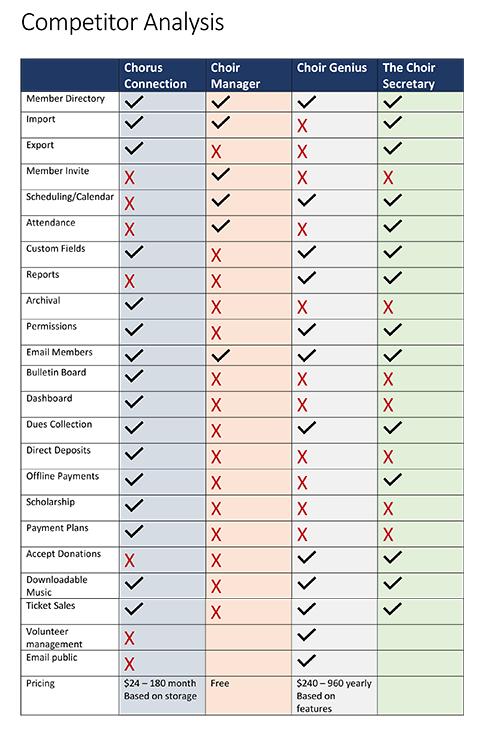
We began this process by doing a Competitor Analysis and Heuristics Evaluation of competing products. We found fully featured products to be expensive with hard-to-understand pricing modules. The lower priced models had limited feature sets. Some projects focused on other target markets such as children’s or youth choir which required involving parents as the actual managers of the user accounts. We decided our focus would be specifically volunteers adult community choirs.
Competitor Analysis
Red Routes
Red Routes were designed to outline the path users would take to register, login, purchase downloads and download the files and mark attendance. The Red Routes also included tasks for administrators including viewing member information, viewing attendance reports, exporting and printing reports, and emailing members.

User Flow
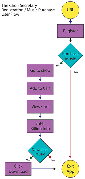
Using the red routes as a base a User Flow diagram was created to demonstrate the steps a choir member would take to complete the tasks as well as the steps administrators would take to view and edit member data.
Sketches
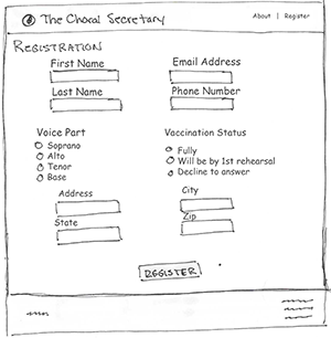
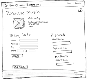
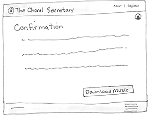
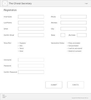
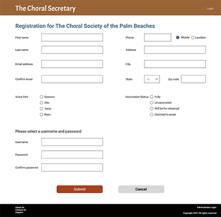
The focus was on designing the user registration, purchase and download features of the application. Sketches were created and then tested with a group of five users (using the MarvelApp to create interactivity). Findings at this stage showed that some necessary fields &emdash; specifically username and password information &emdah; were left off the registration form, labels on several buttons created confusion and the registration link needed to be removed from the site navigation once a user was logged in.




Wireframes
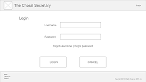
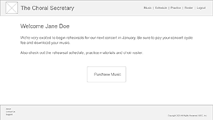
After correcting these issues wireframes were created using Adobe XD and retested with five users. The initial plan was to have users download the music as a zip file. Many of the test participants were unaware of zip files and how to use them. Some of the verbiage confused users as to what they where purchasing and what their next steps were.


Prototype
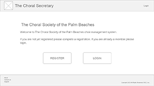
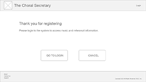
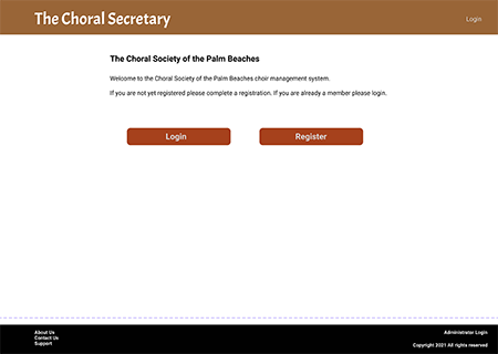
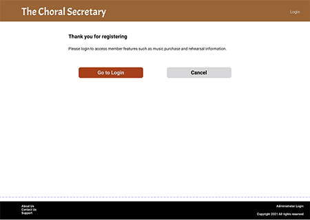
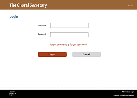
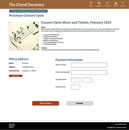
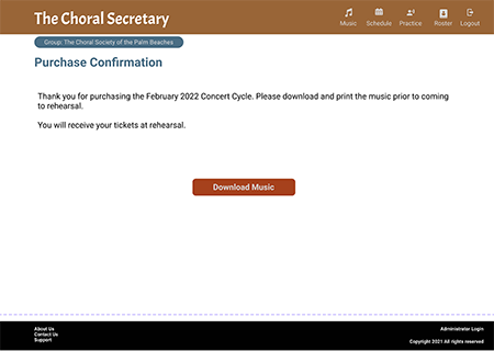
These issues were corrected in the hi-fidelity wireframe (created using Figma) and tested with five more users. Users were very positive about the experience. A few mis-spelled words were found, but the actual procedure worked well for our test participants. One participant was confused by the “Music” link being in the top navigation and in the text copy. Another felt the use of the term “music” led the member to believe they were purchasing music and would own it. Therefore, the wording on the purchase screens have been changed to emphasis the purchase of a concert cycle, as opposed to music.


Outcomes and Lessons
Our test participants found the registration, login, and concert cycle fee purchase to be straight-forward and easy to use. Through testing the flow and the verbiage on the site was honed to help guide the user through the process. Our next steps would be to complete the attendance and then administration portions of the design.